The Role of Colour Tints in Creating a Cohesive Design Language
This site has been a long, careful build. I’ve kept iterating, adding, removing, trying new things, chasing a look that feels cohesive without becoming monotonous.
For a while I leaned on a single favourite colour. But the UI only started to breathe when I embraced a tint system that travels across components. Same language, different voices.
Along the way I dropped a few shiny ideas, doubled down on essentials, and ended up with two things I’m proud of:
- A button system that feels tactile without pyrotechnics.
- A card system that scales from tiny utilities to media‑heavy layouts.
Buttons: From Liquid Glass to Clarity .
My first idea was the “liquid glass” look from Apple iOS teasers—translucent layers, soft blurs, inner shadows, specular highlights. Apple made it look great. I couldn’t.
So I stripped it back.
- Base: a frosted surface, subtle rather than foggy.
- Structure: a clean outer border plus a second inner ring offset by a few pixels for tactility.
- Feedback: on hover, the inner ring strengthens with a soft tint glow.
- Motion: gentle lift on hover, ripple on click, always respecting reduced motion preferences.
- Shapes: pill, rounded, soft, square, and circular for icons.
- Variants: primary, secondary, ghost. Personality comes from tints (amber, orange, blue, emerald, violet, rose, red, cyan, zinc) rather than new skins.
It’s less look at me and more feels right under the cursor.
Cards: Accents, Not Ornaments .
Once buttons felt right, I brought the same attitude to cards. Two families cover most surfaces:
- Standard: subtle, solid, outline, ghost, and a soft gradient for rare emphasis.
- Double‑border: a stronger inner ring treatment that echoes the buttons’ tactility.
I retired decorative corners in favour of slim accent bars—barely noticeable until the layout needs rhythm. Focus rings are clear and tint‑aware. Hover is present but never steals the show.
The hardest challenge wasn’t borders but media. Images resisted the radius, padding fought the inner border, aspect ratios misbehaved. The fix: media helpers with intrinsic sizing, optional padding, and explicit fit modes for cover or contain. Now images feel native, not bolted on.
System Shape .
I wanted a system that felt small on purpose. One palette of tints became a shared language—the kind you hear in buttons, notice again in cards, and later in a caption under a photo.
- Components as characters: buttons speak in three voices; cards have more range.
- Spacing as rhythm: normal for everyday pace, compact for quick lists and side panels.
- Corners as cues: pill, rounded, soft, square—media inherits the same shape.
- Layouts as scenes: stacked or side‑by‑side, always led by content.
The rules keep me honest:
- Contrast first, then colour.
- Focus visible for mouse and keyboard.
- Motion quiet, stepping back when asked.
- Links and buttons carry clear names.
- Images explain themselves—or stay silent if decorative.
Under the hood, choices stay modest: soft gradients, light shadows, no heavy blur. Images load lean and fit their space. Light and dark are two rooms with the same furniture. Guardrails keep contrast, opacity, and elevation in check.
In the end, it’s the quiet details that do the work: a thin inner ring that firms up on hover, two slim accent bars guiding the eye. Easy to miss at first—until you notice they’ve held the whole space together without ever asking for attention.

What’s Next .
The next step is a more cohesive motion layer. The pieces are already there—lift, glow, ripple, animated ring—but I want them to feel orchestrated rather than additive.
Seasonal experiments are likely, with a small holiday refresh calling. Ongoing polish continues with spacing, density, and contrast tuning so the system ages well and keeps earning its same but different promise.
If you notice a tiny inner ring doing more than its fair share, that’s intentional. It’s the smallest possible nudge that says: this was made for your hands.

Related Mo'ments
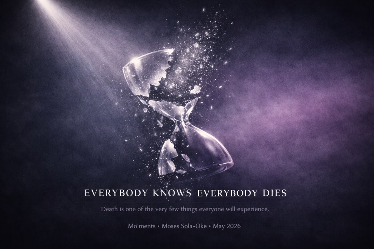
Everybody Knows Everybody Dies
Death is one of the very few things literally everyone who was ever born will experience, yet we treat it as something to deal with later. This is an argument for doing the work now, before later becomes too late.
The Calendar Isn’t the Boss of Me
Why I'm doing the exact same thing on Valentine's Day as I would any other day and what that says about love, expectations, and made-up holidays.
The Tyranny of In‑App Browsers
In‑app browsers are a quiet tyranny — breaking websites, trapping users, and eroding the open web while pretending to be “secure.” After watching my own site fail inside Instagram’s WebView, I’m calling this behaviour out for what it is.